39°N / We open what matters


JOYS – Jewelry for the New Era
Our clients approached us with a budding jewelry brand, JOYS, and a clear request: redesign the interior of their first shop in Madrid and refresh their visual identity. But we didn’t just tweak things — we took a lateral somersault and delivered the full branding, naming, visual identity, and verbal universe, creating a jewelry brand designed to empower the next generation.
The challenge was clear: turn a traditional jewelry sector upside down and create a brand that could become a true love brand for young audiences.
From market analysis to trend research, we validated our initial hunch: the jewelry market was static, elitist, and ignoring the desires of a new generation. Young people no longer see jewelry as elegant or status-driven — they want individuality, self-expression, and style.
We developed a strategy that positioned JOYS as “jewelry for the new era”, with a bold visual and verbal identity that speaks the language of youth, rebellion, and contemporary culture.
We embraced the energy of street culture and trap aesthetics to craft a brand that is fresh, powerful, and free:
Every detail — from the logo to the photos to the copy — reinforces JOYS as a disruptive, relevant, and aspirational jewelry brand.
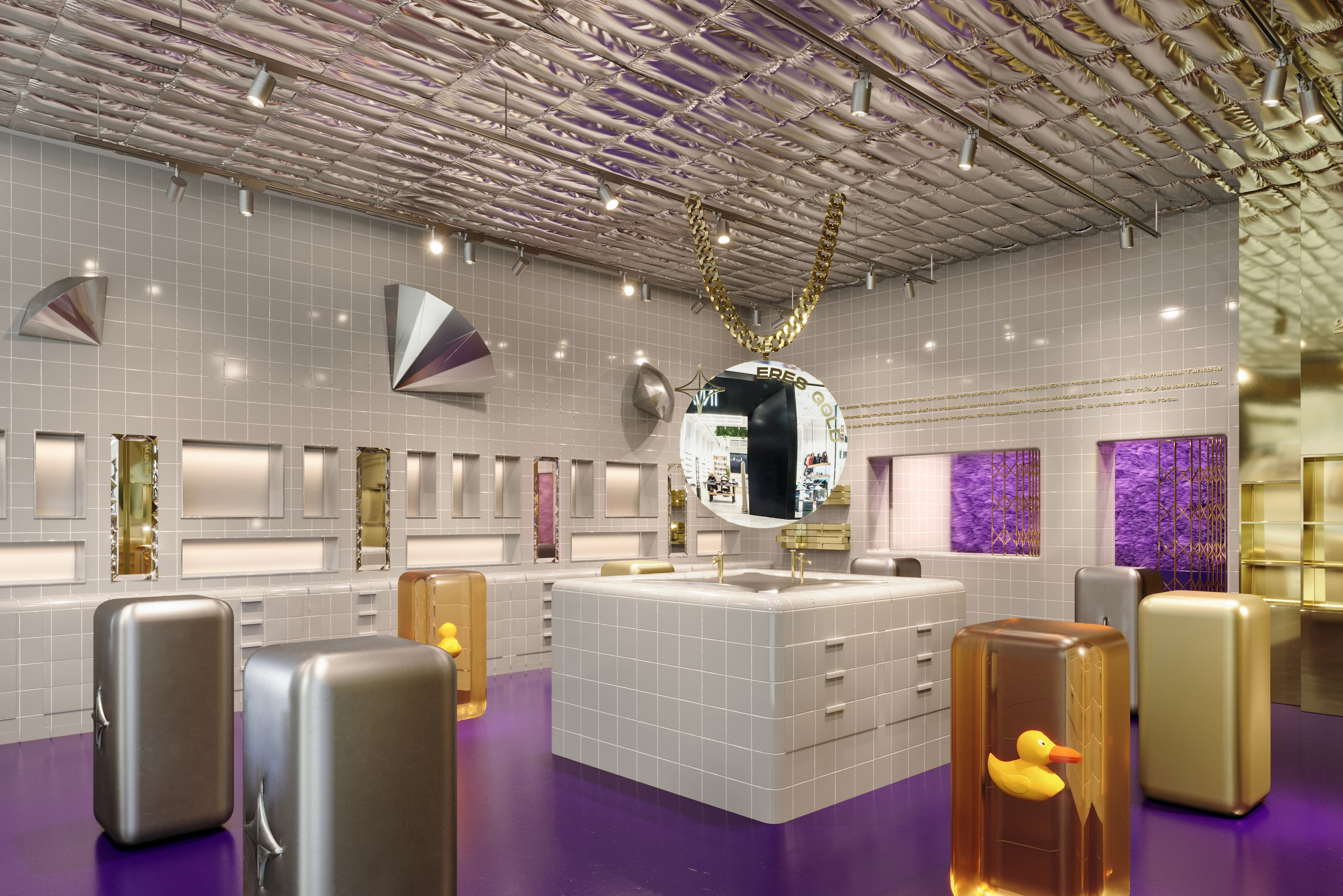
The interior design of JOYS is just as provocative and unexpected as the brand itself.
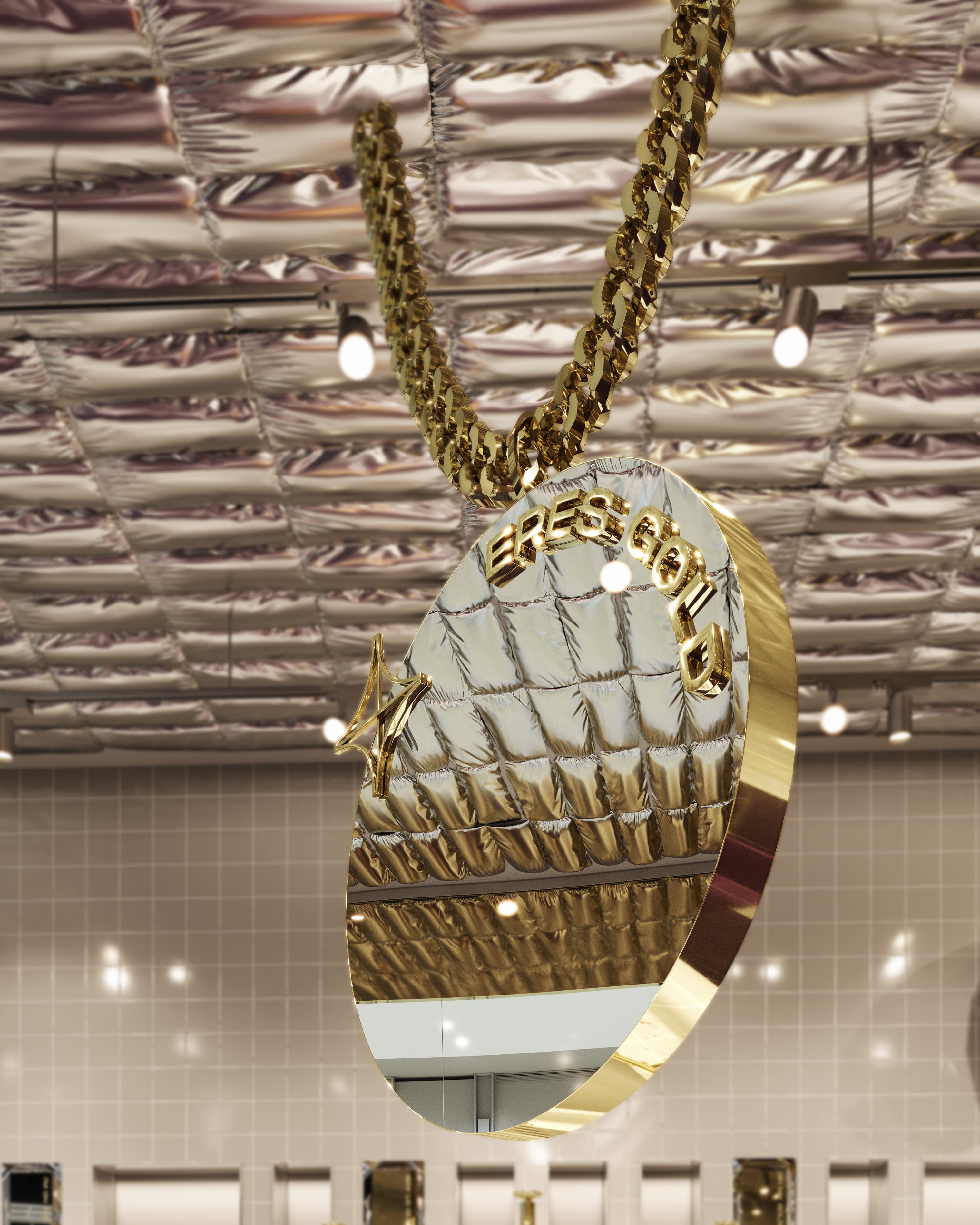
Inspired by the everyday vibe of trap music videos, we created a jewelry-bathroom hybrid:
The result is an immersive, bling-heavy environment, completely disruptive for jewelry retail — but entirely coherent with JOYS’ identity.


