39°N / We open what matters


Dearmen – Modern Masculinity Reimagined
Dearmen is a brand for modern men redefining masculinity in a contemporary world. Our client tasked us with creating a brand from scratch for “men of our time” — a masculine, community-focused brand — and we developed a comprehensive brand strategy, naming, visual identity, and narrative to bring this vision to life.
We began by challenging traditional definitions of masculinity. Dearmen is built for men who want to explore and express their true selves. Our strategy identified a niche of men rejecting outdated stereotypes and seeking authentic self-expression.
From this insight, we created a brand positioning and identity: the naming “Dearmen” immediately conveys intimacy and trust, while the verbal identity — affectionate, playful, and provocatively human — encourages men to embrace emotions, contradictions, and authenticity.
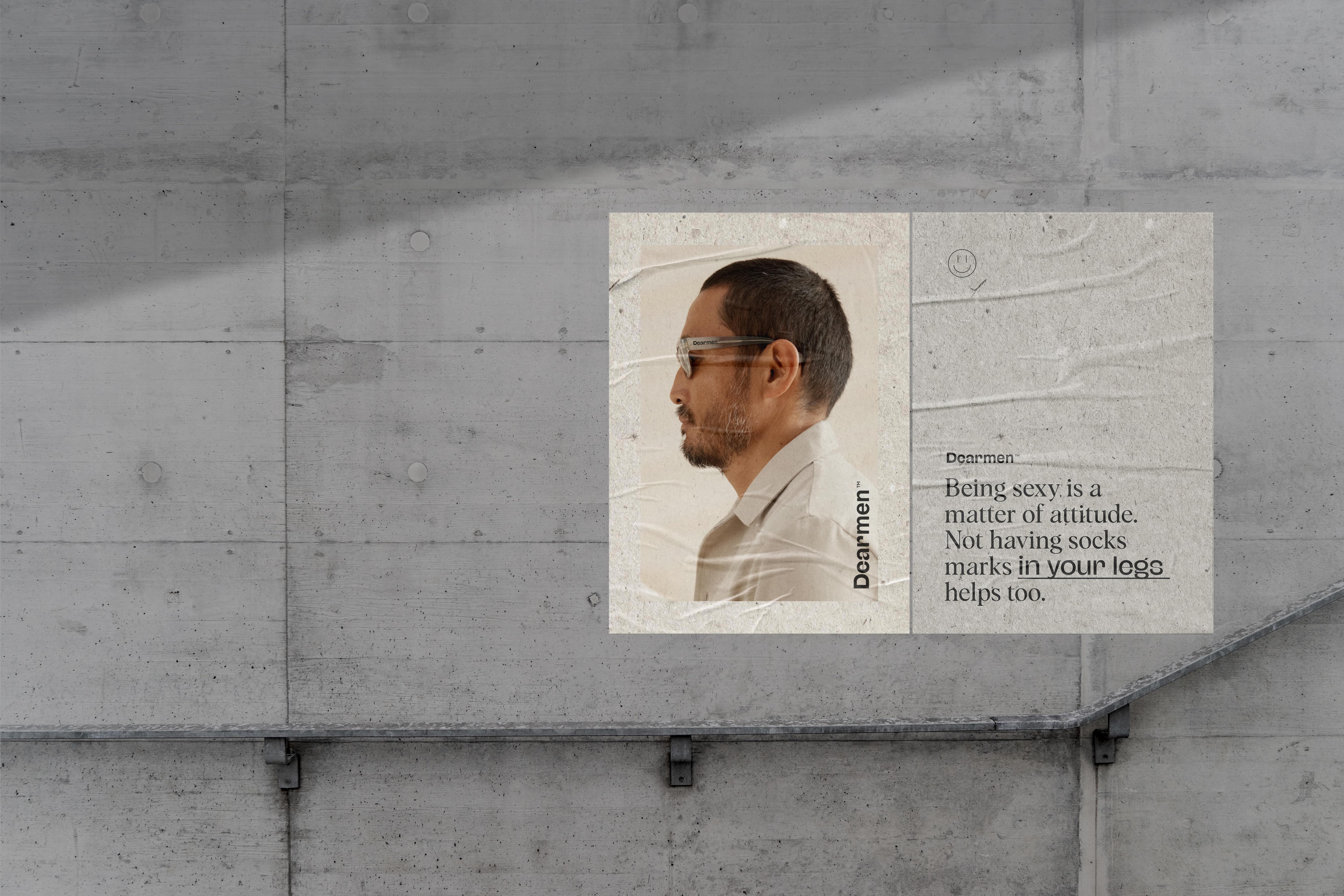
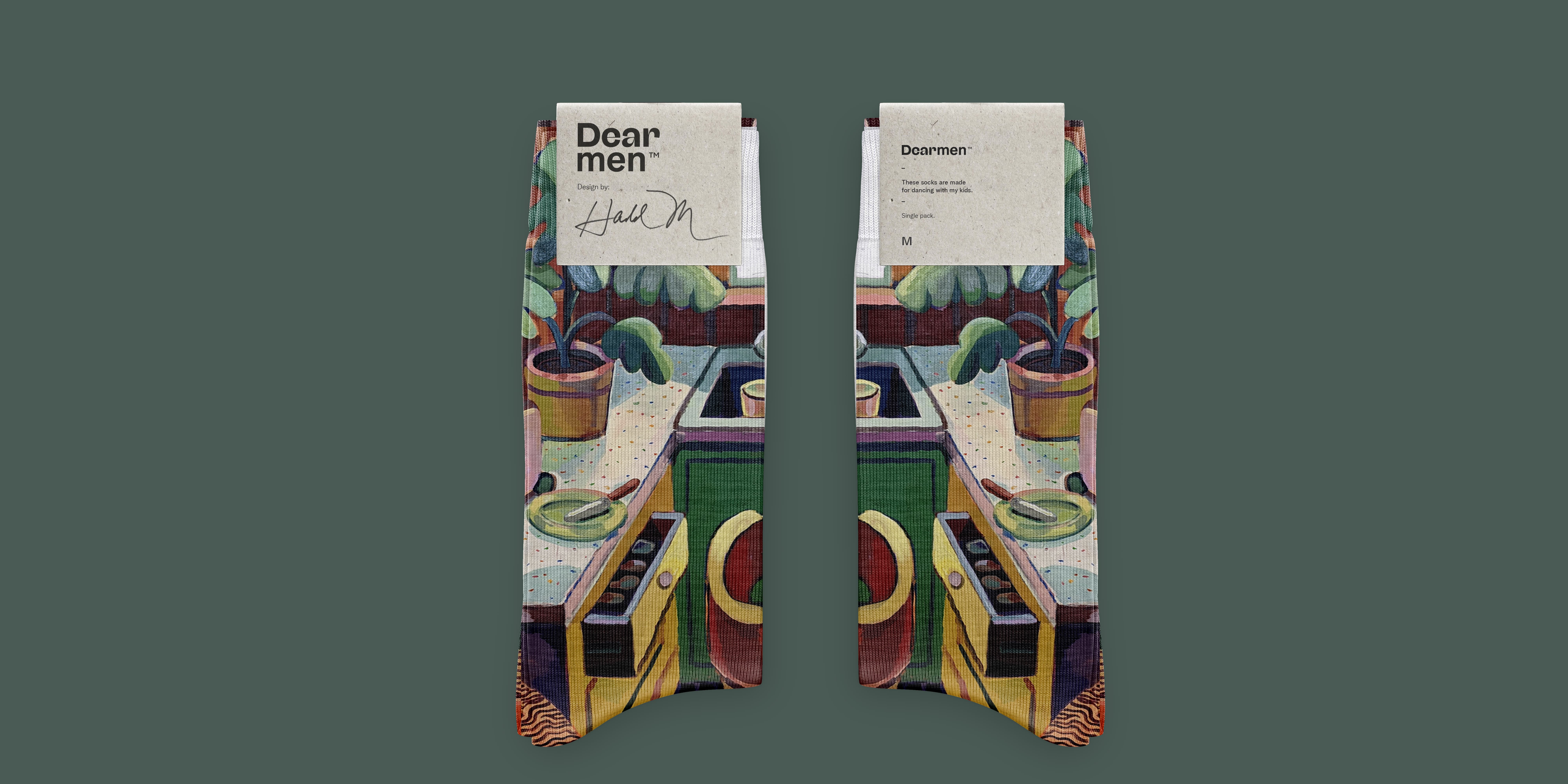
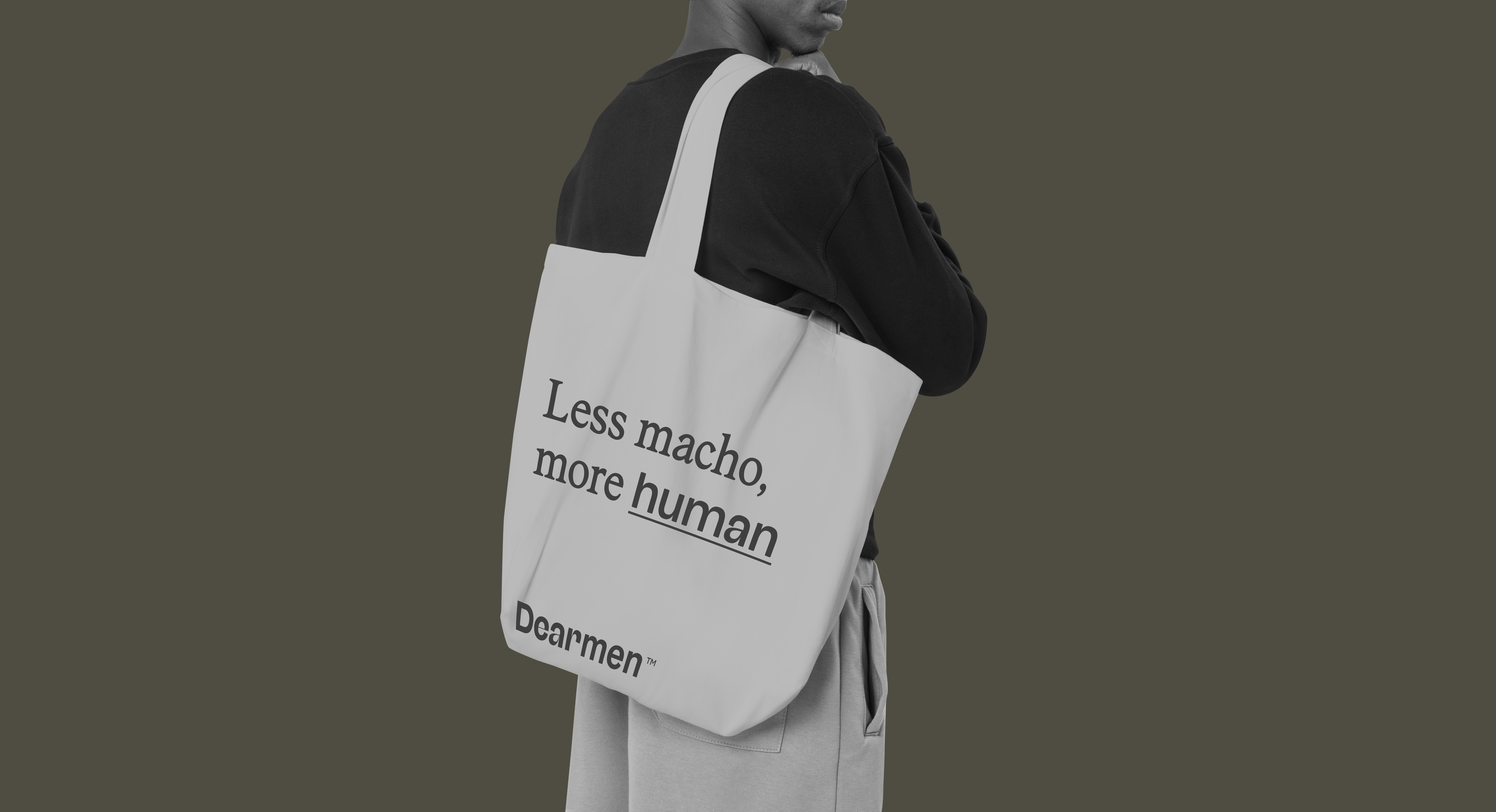
The corporate identity and visual universe were designed to reflect this new approach to masculinity. The logotype combines Alfreda, a calligraphic font, with Albra, adding modernity, while the symbol uses the initials of the brand name. The visual language integrates neutral color tones, letter-inspired aesthetics, and photography of men defying traditional standards, creating a cohesive, modern, and expressive identity.
This approach ensures that every element — from brand strategy and storytelling to typography, logo, and visual identity — communicates a bold, contemporary, and human-centered brand.
Dearmen is more than a brand; it is a game-changing men’s brand. It empowers men to explore every side of themselves, embrace their emotions, and celebrate imperfection.
By breaking the traditional rules of masculinity, Dearmen builds a community of modern men focused on authenticity, freedom, and self-expression. Its tone is bold, intimate, and culturally aware, with references from music, pop culture, and history that challenge outdated norms while creating connection.
This brand strategy positions Dearmen as a leading example of contemporary masculine branding, helping men feel represented in today’s evolving social landscape.
Dearmen delivers a visual and emotional brand experience:
The result is a modern, inclusive brand for men that inspires authenticity, creativity, and connection. Dearmen is a human-centered branding example that speaks directly to men of our time — bold, expressive, and unafraid to show emotion.
Cooked up at WANNA, our former studio.


